Redesigning My Personal Website with Claude Code
Three years ago, I wrote about creating this website using Jekyll, GitHub Pages, and a custom domain. That post is still one of the most-read things on my blog. The site served me well since then — it helped during job interviews, got me a few consulting projects, and became a home for 190+ ML paper reviews.
But I felt that by early 2026, the site was in need of a refresh:
- Some content was outdated (About and Career pages weren’t updated for years)
- Some pages weren’t structured well (Actitivies page was a flat chronological list, Projects page had exactly two entries, Tags page was a wall of unsorted tags)
- And the site itself lacked many basic features, like search or dark mode support
I did the redesign in two waves. I started with infrastructure improvements (search, dark mode, structured data, footer, sharing). Then I did a full content and layout overhaul using Claude Code.
Wave 1: infrastructure improvements
Before touching any content, I wanted to fix the technical foundation. It took several sessions to make them.
Full-text search
The site had no search functionality at all. With 190+ posts, finding something specific meant scrolling through the blog listing or using the browser’s Ctrl+F on the tags page. I added a client-side search powered by a JSON index file that Jekyll generates at build time. The search modal opens with Ctrl + K (or Cmd + K on Mac) and supports multi-term filtering across titles, descriptions, tags, and content.
The search index is generated by a search.json file with Liquid:
[{% for post in site.posts %}
  {
    "title": {{ post.title | jsonify }},
    "url": "{{ post.url }}",
    "date": "{{ post.date | date: '%b %d, %Y' }}",
    "description": {{ post.description | jsonify }},
    "tags": {{ post.tags | jsonify }},
    "content": {{ post.content | strip_html | truncatewords: 50 | jsonify }}
  }{% unless forloop.last %},{% endunless %}
{% endfor %}]
The JavaScript fetches this JSON once on the first search, then filters locally. It is not as powerful as Algolia or Lunr, but it works well enough for a static site with a few hundred posts and requires no external service.
Dark mode
The site already had a basic dark mode toggle from an earlier refactor, but it was incomplete — many elements (code blocks, tables, form inputs, the career timeline) still used hardcoded light colors. I expanded the dark-mode.css file from about 100 lines to over 250, covering every component on the site. The dark mode toggle also needed to sync with the Utterances comment theme, so switching to dark mode now sends a postMessage to the Utterances iframe:
const updateUtterancesTheme = (theme) => {
  const utterancesFrame = document.querySelector('.utterances-frame');
  if (utterancesFrame) {
    utterancesFrame.contentWindow.postMessage(
      { type: 'set-theme', theme: theme },
      'https://utteranc.es'
    );
  }
};
Speaking of Utterances — the comments had an embarrassing bug. The comment section did not appear at all until you manually refreshed the page. The cause was that the site uses AJAX navigation (via History.js in personal.js), so navigating to a post did not trigger a full page load. The Utterances <script> tag was embedded inline in the post layout, and inline scripts only execute on initial load — AJAX page transitions skip them entirely. The fix was to replace the inline script with a placeholder <div id="utterances-container"> and move the Utterances initialization into personal.js, where it runs on every page transition.
This also handles the initial dark mode state — the theme is read from localStorage at injection time, so comments load with the correct theme from the start. The postMessage approach described above is still needed when the user toggles dark mode while comments are already visible.
Structured data and OpenGraph
I added JSON-LD structured data for both the site (WebSite schema) and individual blog posts (BlogPosting schema). The blog post schema includes headline, description, author, publication date, and keywords from tags:
<script type="application/ld+json">
{
  "@context": "https://schema.org",
  "@type": "BlogPosting",
  "headline": "Redesigning My Personal Website with Claude Code",
  "description": "A practical walkthrough of redesigning a Jekyll personal website — adding search, dark mode, structured data, and a full card-based redesign using Claude Code. What changed, what broke, and what it is like to iterate on a site with an AI coding assistant.",
  "datePublished": "2026-03-23T00:00:00+00:00",
  "author": {
    "@type": "Person",
    "name": "Andrey Lukyanenko",
    "url": "https://andlukyane.com/"
  },
  "keywords": ["blogpost","career"]
}
</script>
I also added missing OpenGraph tags (og:url, og:type) and a Twitter Card twitter:site tag. These are small changes, but they improve how links appear when shared on LinkedIn, Twitter, and other platforms. The og:type dynamically switches between article for blog posts and website for other pages.
Floating share bar and footer redesign
Blog posts got a floating share bar on desktop — four social buttons (Twitter, LinkedIn, Facebook, Reddit) that appear when you start reading and disappear when you scroll past the article. The visibility is controlled by checking the article’s bounding rectangle on the scroll:
function check() {
  var rect = article.getBoundingClientRect();
  var show = rect.top < window.innerHeight * 0.3
          && rect.bottom > window.innerHeight * 0.5;
  bar.classList.toggle('visible', show);
}
window.addEventListener('scroll', check, { passive: true });

The footer was redesigned from a single-column layout to a three-column grid (about, quick links, social icons) using CSS Grid. I also added proper focus-visible styles for accessibility across all interactive elements.
Wave 2: content and layout overhaul with Claude Code
With the infrastructure in place, the site still had the same content problems: outdated positioning, buried content, and flat hierarchies. For this part, I used Claude Code to do the whole thing in a single session (not one-shot).
Gathering ideas
First, I prepared a list of what I wanted to change myself, then asked three AI assistants (ChatGPT, Claude, Gemini) to analyze the live site and suggest improvements. All three converged on the same core problems: the strongest professional signals were buried or absent, good content was difficult to find, and some content was years out of date. I saved their suggestions into Markdown files, compared the overlapping recommendations, and wrote a combined improvement plan.
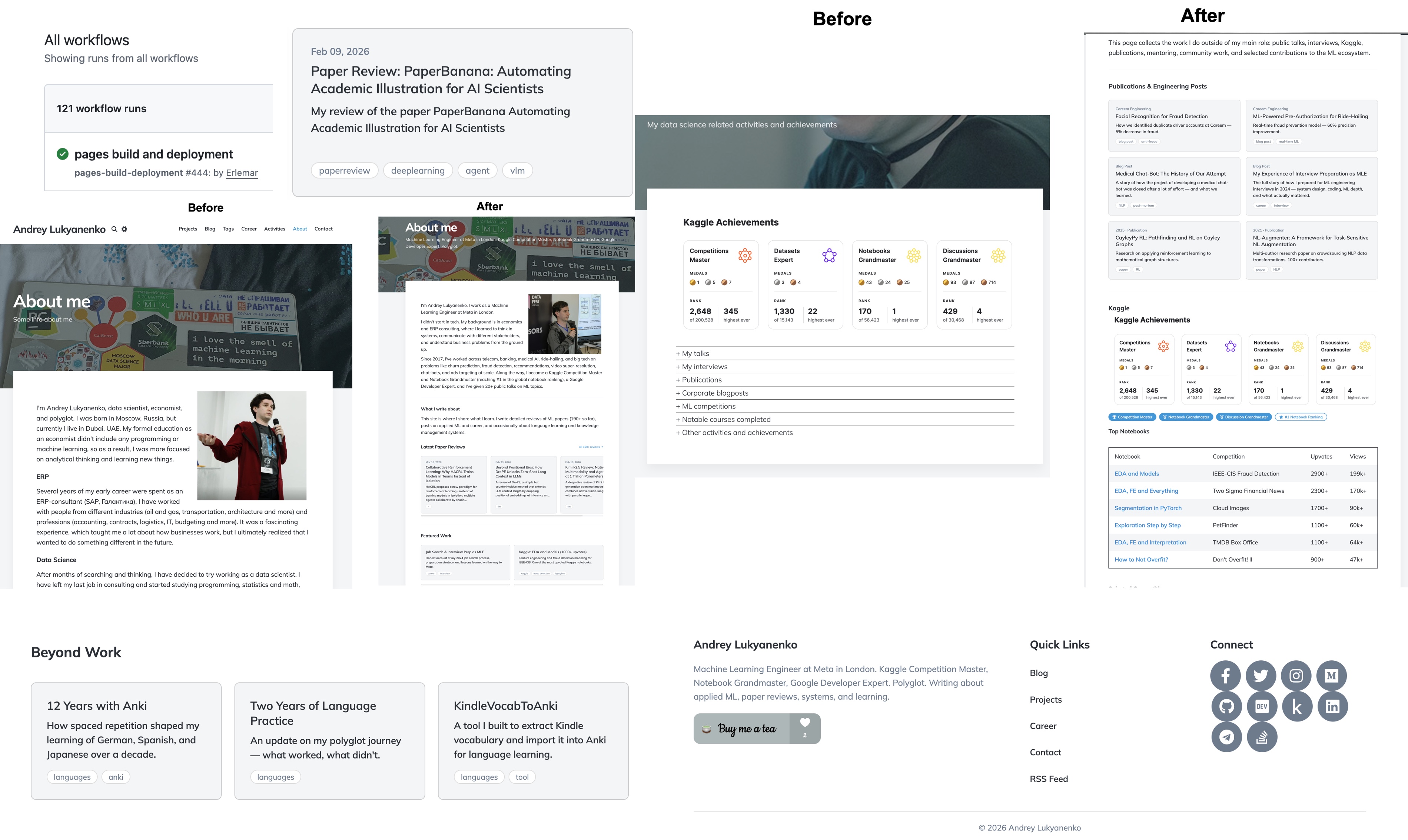
About page
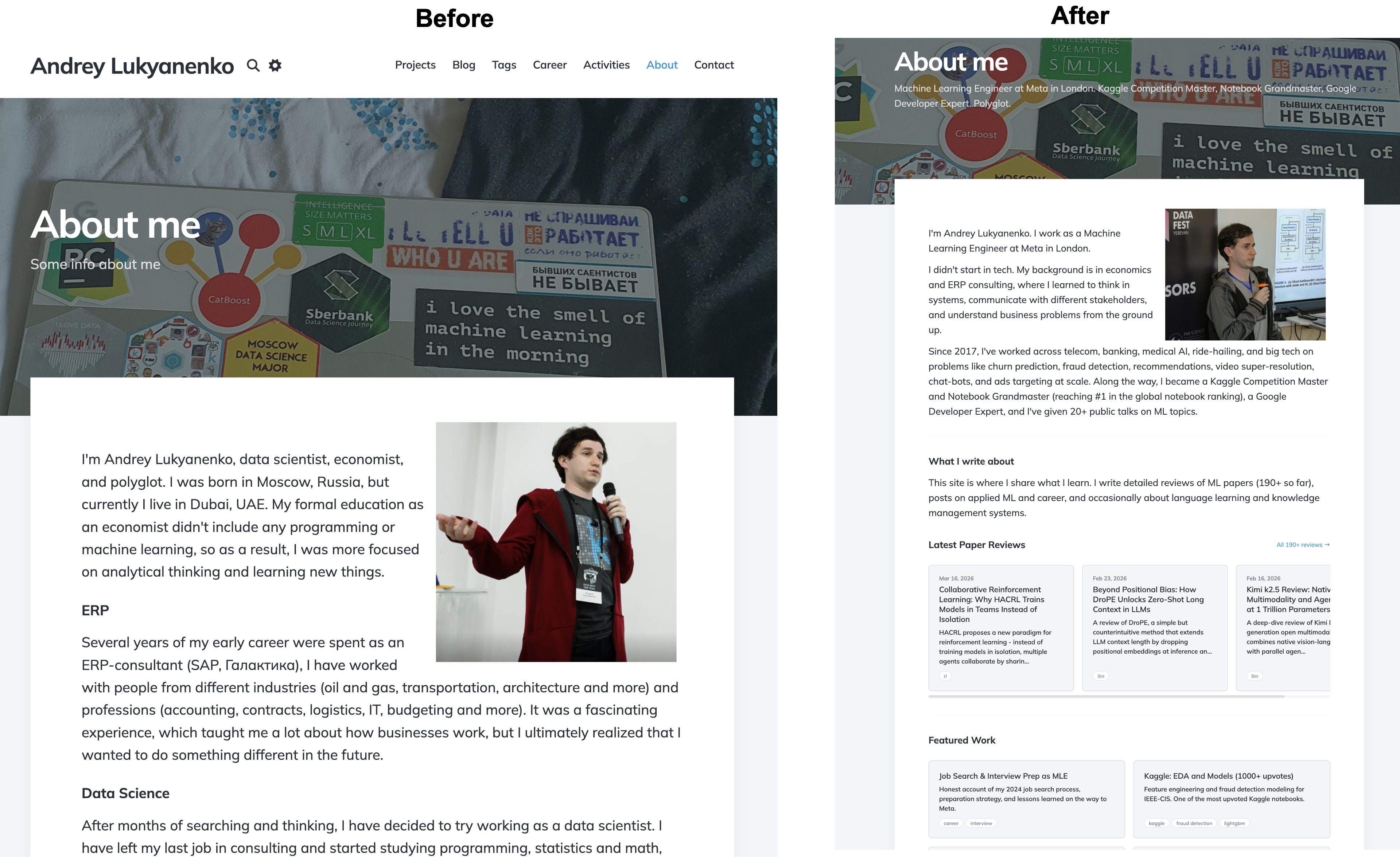
The old page was a chronological autobiography. The new page is structured as a hub: a short intro, a row of credential badges, a horizontally scrolling “Latest Paper Reviews” section, curated “Featured Work” and “Beyond Work” card grids, and a collapsible section for fun facts at the bottom.
The “Latest Paper Reviews” section autopopulates using a Liquid include:
{% assign reviews = site.posts | where_exp: "post",
    "post.tags contains 'paperreview'" %}
{% for post in reviews limit:3 %}
<a href="{{ post.url }}" class="card">
  <div class="card__meta">{{ post.date | date: "%b %d, %Y" }}</div>
  <div class="card__title">{{ post.title }}</div>
  <div class="card__description">
    {{ post.description | truncate: 140 }}
  </div>
</a>
{% endfor %}
The horizontal scroll is done with pure CSS using flexbox and overflow-x: auto:
.card-scroll {
  display: flex;
  gap: 20px;
  overflow-x: auto;
  scroll-snap-type: x mandatory;
  -webkit-overflow-scrolling: touch;
}

.card-scroll .card {
  min-width: 280px;
  max-width: 340px;
  flex-shrink: 0;
  scroll-snap-align: start;
}
The main technical challenge was that Jekyll refused to process Liquid tags in the root index.html. After debugging, the cause turned out to be a quirk of how Jekyll handles root-level files — possibly a conflict with the paginator plugin. The fix was moving the homepage to _pages/home.html with permalink: /. Not obvious, and the kind of thing that wastes hours.
Card component system
Most visual changes are built on a reusable CSS card system (css/cards.css, 237 lines). The core card is a simple flexbox column with a hover effect:
.card {
  background: var(--background-alt-color, #f4f5f6);
  border-radius: 8px;
  padding: 24px;
  transition: box-shadow 0.3s ease, transform 0.2s ease;
  display: flex;
  flex-direction: column;
}

.card:hover {
  box-shadow: 0 4px 20px rgba(0, 0, 0, 0.1);
  transform: translateY(-2px);
}
Cards are placed in responsive grids that go from one column on mobile to two or three on desktop:
.card-grid {
  display: grid;
  grid-template-columns: 1fr;
  gap: 20px;
}

@media (min-width: 768px) {
  .card-grid { grid-template-columns: repeat(2, 1fr); }
}

@media (min-width: 1024px) {
  .card-grid--3 { grid-template-columns: repeat(3, 1fr); }
}
Tag chips are small pill-shaped links that appear on cards and in the blog listing:
.tag-chip {
  display: inline-block;
  font-size: 12px;
  padding: 4px 10px;
  border-radius: 12px;
  background: var(--background-color, #ffffff);
  color: var(--text-light-color, #6B7B8D);
  border: 1px solid var(--border-color, #dddddd);
  transition: background 0.2s ease, color 0.2s ease;
}

a.tag-chip:hover {
  background: var(--accent-color, #3498db);
  color: #ffffff;
  border-color: var(--accent-color, #3498db);
}
Everything uses CSS custom properties, so dark mode works automatically.
Blog listing tag chips

Every post in the blog listing now shows up to four clickable tag chips. The first attempt had an interesting bug: the entire blog post card was clickable via a jQuery handler in personal.js, so clicking a tag chip navigated to the post instead of the tag page. The fix was a guard in the click handler:
$(document).on('click', '.post', function (e) {
  if ($(e.target).closest('.tag-chip').length) {
    return;  // let the tag link handle its own navigation
  }
  // ... existing post navigation code
});
Other pages
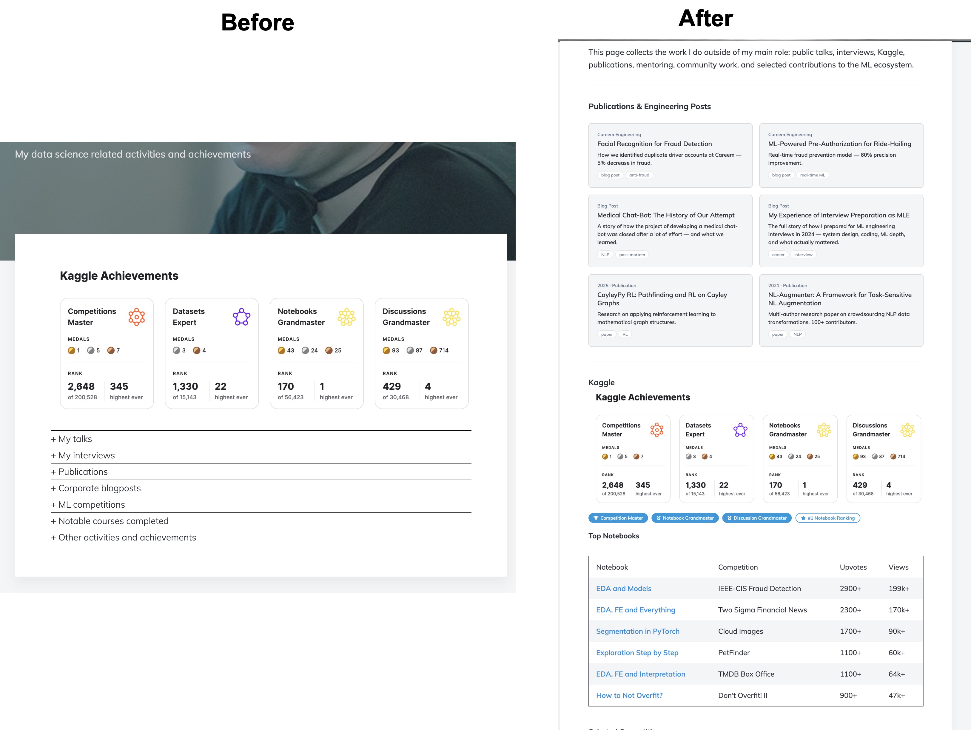
I restructured the Activities page from flat collapsible lists into cards for publications and talks, data tables for Kaggle notebooks and competitions, and compact inline archives for the full talk history. The Projects page went from two entries to eight, organized into Featured Projects (with images), Production ML, and Tools and Writing. The Tags page now groups 120+ tags into 12 thematic categories displayed as a two-column card grid, and individual tag pages show posts as cards instead of plain lists.
Working with Claude Code
Most of the changes were done in a single Claude Code session over a couple of days. The most useful pattern was version comparison: for each major page redesign, I asked it to create three versions at temporary URLs (/about-v1, /about-v2, /about-v3), previewed them all in the browser, and described which elements to combine. It is faster to compare three concrete implementations than to describe an abstract preference in words. One version could have a better visual appeal, another one - better structure, another one - a new useful feature, and so on.
Not everything worked well on the first attempt; I had to spend considerable time on debugging and testing. For the Liquid processing issue, Claude Code tried several approaches — adding layout: page to the front matter, moving Liquid into an include file, and finally identifying that the _pages collection was the correct fix. It diagnosed problems by inspecting the built _site/index.html output and checking whether Liquid tags had been resolved. For the tag chip click issue, it found the jQuery handler, understood the event propagation, and added the guard.
All content decisions were mine — which posts to feature, what texts to write, what to include or exclude. Some CSS required several iterations because I could see the rendered result, but Claude Code could only verify by grepping the HTML output. When I sent screenshots of broken layouts, it could usually identify the issue, though not always on the first try. It also occasionally generated text that was too promotional, which I had to tone down.
Summary of changes
| Metric | Before | After |
|---|---|---|
| Search | None | Full-text with Ctrl+K |
| Dark mode coverage | Partial | Complete (250+ CSS rules) |
| Structured data | None | WebSite + BlogPosting JSON-LD |
| OpenGraph tags | Partial | Complete (og:url, og:type, twitter:site) |
| Share functionality | Bottom of post only | Floating sidebar + bottom |
| About page | Chronological bio | 6 sections with cards and badges |
| Projects shown | 2 | 8 |
| Activities structure | Flat lists | Cards, tables, compact archives |
| Tag organization | Flat list | 12 thematic card groups |
| Blog tag chips | None | Up to 4 per post |
Conclusions
The site now reflects where I am in 2026 rather than where I was in 2021 or 2023. The design is still built on a purchased Jekyll theme with incremental modifications, but it is much better at helping people discover useful content. For me, this is good enough.
Additionally, this was an interesting exercise in using AI to improve a personal website. I remember that it took me almost a month to set up the initial version, then days or weeks to make specific changes because I didn’t know web development well enough. This redesign took less than a week in total, and I learnt a lot about using AI and web development.
blogpost career